As part of the course to get my UX/UI Design diploma, I was tasked to design a new website for a virtual client. The client was a new hotel and were looking to create an online booking experience that was simple, accessible and based on a deep understanding of their target users. We had to pick between mobile and desktop, so I decided to focused only on the desktop version for this website.

The focus was specifically on the hotel booking process: how users search for and book hotel rooms online. The end goal was to design and build a clickable prototype that could be tested with users.

In order to do this, I went through the full UX process:
This was an individual project, I was the sole UX researcher as well as UX and UI designer.

This project was completed over a period of 8 months (part-time).

This project was created using Miro, Sketch, inVision.
FULL PROTOTYPE —
Scroll down to see the breakdown of the full process that was used to create this fully clickable prototype.

You can also contact me at contact@aquacorp.uk if you would like to request the link to interact with the prototype yourself.

This is a video depicting the full prototype with interactions I created for this course: a hotel booking website

RESEARCH
COMPETITIVE BENCHMARKING —
The project started with a research of competitors to produce a competitive benchmark in order to define which aspects of the projects I was going to look at specifically, as well as familiarising myself with what was done within the industry.

I decided to conduct my competitive benchmark between the four following brands:
— Marriott Bonvoy
— Premier Inn
— Novotel
— Booking.com

The aspects I compared were:
— Homepage
— Search & Select
— Checkout

I decided to highlight the following on each page:
— In green, what offers a positive experience to the user
— In orange, what is expected and should absolutely be there
— In red, what offers a rather negative experience to the user and should be improved

Full competitive benchmarking available upon request.
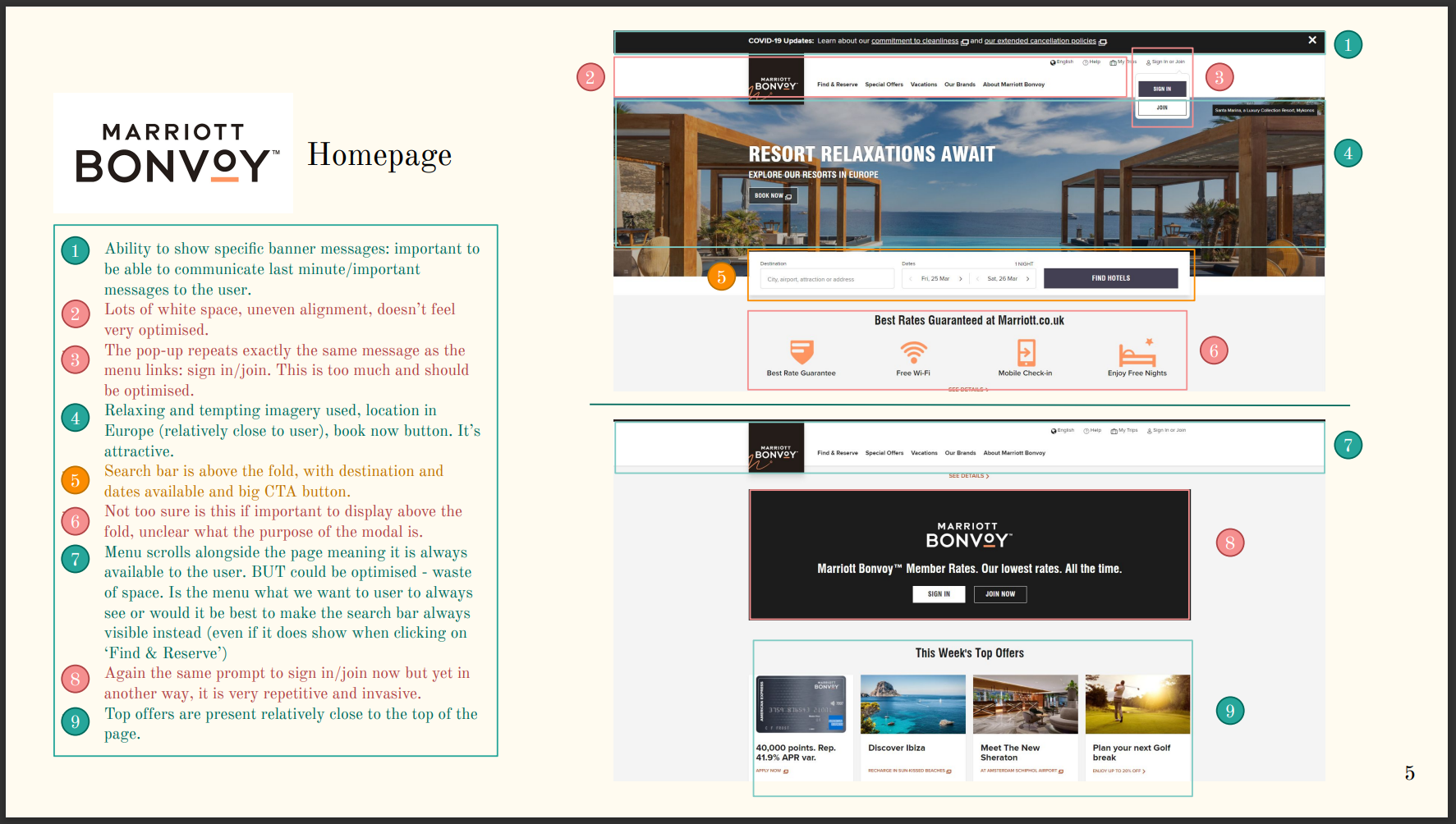
Example of a page from my competitive benchmark showing analysis of the Mariott Bonvoy homepage
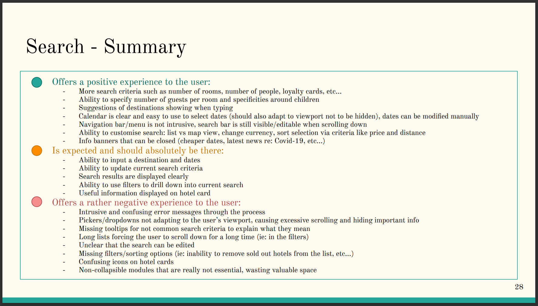
Example of a summary page from my competitive benchmark listing positive experience, expected aspects and negative experience for the Mariott Bonvoy website
ONLINE SURVEY —
The goal of this online survey was to help to define the research objectives for the projects, which were the main pain points from users when they are using hotel booking websites, what are they trying to achieve and what they need. 

For a real project, I should have been aiming to distribute this survey to 400 or 500 people, but for the purpose of the course, I only asked 15 people around me to fill it out.

The online survey was created using Google Forms and distributed online to friends and family.

Full online survey available upon request.

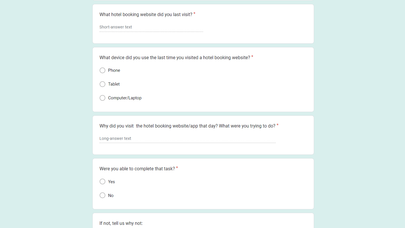
Screenshot of a part of the online survey I created depicting a few of the questions

NOTE TAKING —
For this assessment, we were provided with two usability tests that were previously recorded. 

The goal was to learn to take detailed notes, while focusing on the goal, behaviour, context, positive interactions and pain points for each participants.

The usability tests were conducted with 2 different participants, where they were asked general questions around their hotel booking habits, and asked to test two different hotel booking websites: Barcelo Hotel Group & Doyle Collection.

Full note-taking document available upon request.

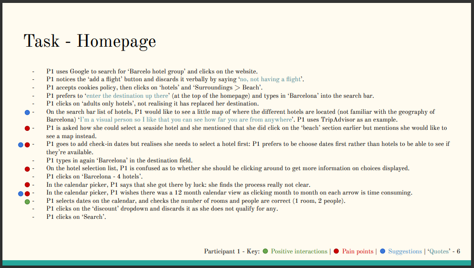
Screenshot of a note-taking page I did while listening to a recorded usability test of people going through hotel booking websites

USABILITY TESTING —
In order to get insights directly from users, I conducted an online usability test with a friend of mine. This assessment was very useful to understand how to set up, moderate and record a usability test. 

The usability test was divided into two main parts: an interview to understand general habits of the user when it comes to online hotel booking and then a couple of scenarios to follow on two different hotel booking websites: Barcelo Hotel Groups & Doyle Collection. 
ANALYSIS
AFFINITY DIAGRAM —
After gathering a lot of data through my research, it was time to analyse it. The first analysis I conducted was an affinity diagram. 

I started with a brainstorming. During this step, I regrouped all the notes I had from the different type of research I did since the beginning of the course: competitive benchmarking, online survey, note taking and usability test. 

I used a Miro board instead of a physical board due to the lack of space at home, as well as the flexibility a digital solution offers. I typed each observation and piece of info I gathered during my research into different post-it notes, following a colour coding organisation.

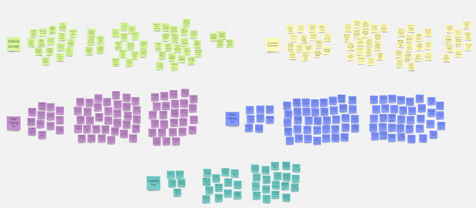
Screenshot of Miro showing all the post-it notes containing the research results I gathered, grouped by research method

I then went through a stage of initial grouping. 

For this step, I copied and pasted the post-it notes of step 1 into a new frame and started moving them around into different themes. 
I tried staying away from grouping them exclusively by the different pages the user would go through from start to finish, to see if some themes covered the overall experience as well. 

I also avoided having groups for pain points vs good experience, and instead decided to highlight pain points with red dots on the notes so that they are easier to spot within the groups. 

I ended up with 32 groups of notes, some very small, some bigger. I think the result gives a good idea as to what important themes kept coming back during the research phase and what matters to the users when it comes to visiting a hotel booking website.

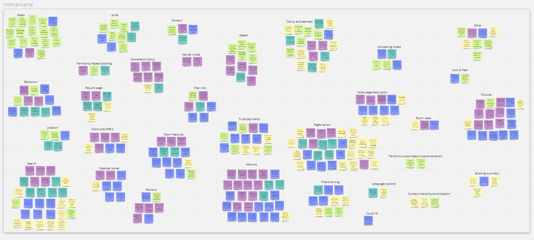
Screenshot of Miro showing the initial grouping of post-it notes

I went through the groups again and decided on a final grouping.

During this step, I tried to identify more high level themes that would allow me to group some of the themes I had already identified in the previous phase. 

This forced me to review the content of some of my groups, and re-dispatch some of the notes I had grouped together in other groups. For example, what I had originally identified as ‘Flexibility/customisation/personalisation’ ended up going in the ‘Search’ and ‘Comparing Hotels’ groups as I thought it made more sense. 

I identified 3 major themes for my groups: 
1. Content: this contains anything to do with the actual content of the hotel offering like prices, pictures or room features. 
2. Layout & code: this is anything related to the ease of use of the website, that can be optimised via the code (front-end/backend) or a better design upfront such as the speed of pages, ability to filter content, etc… 
3. User flow: this theme contains anything that has to do specifically with steps in the user journey through the booking website and components the user will interact with such as the Search function or the add-ons page. 

On top of this, I have also identified notes related to Goals, Context, Behaviours and Mental Models, which I have kept separate.

Full affinity diagram document available upon request.

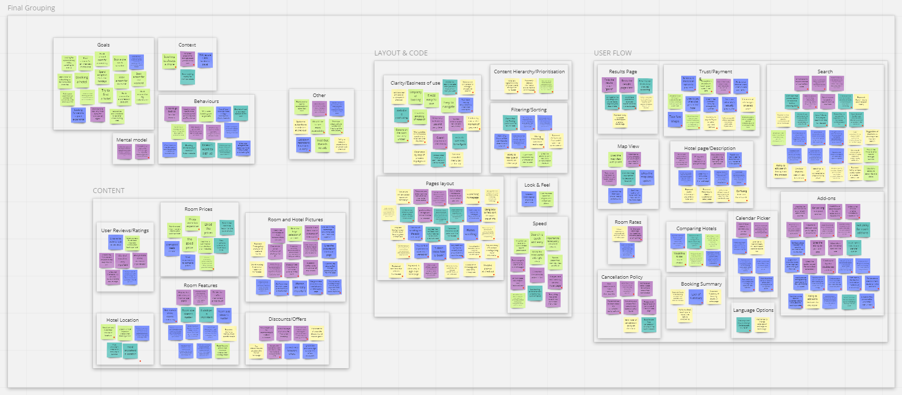
Screenshot of Miro showing the final grouping of post-it notes: Content, Layout & code, User Flow as well as Goals, Context, Behaviours and Mental Models

CUSTOMER JOURNEY MAP —
Building up on the work done with the affinity diagram, I created a customer journey map to put more structure on the analysis of my research data. I focused on the happy path for what I believed to be a common journey for the customers of a Hotel Booking website. 

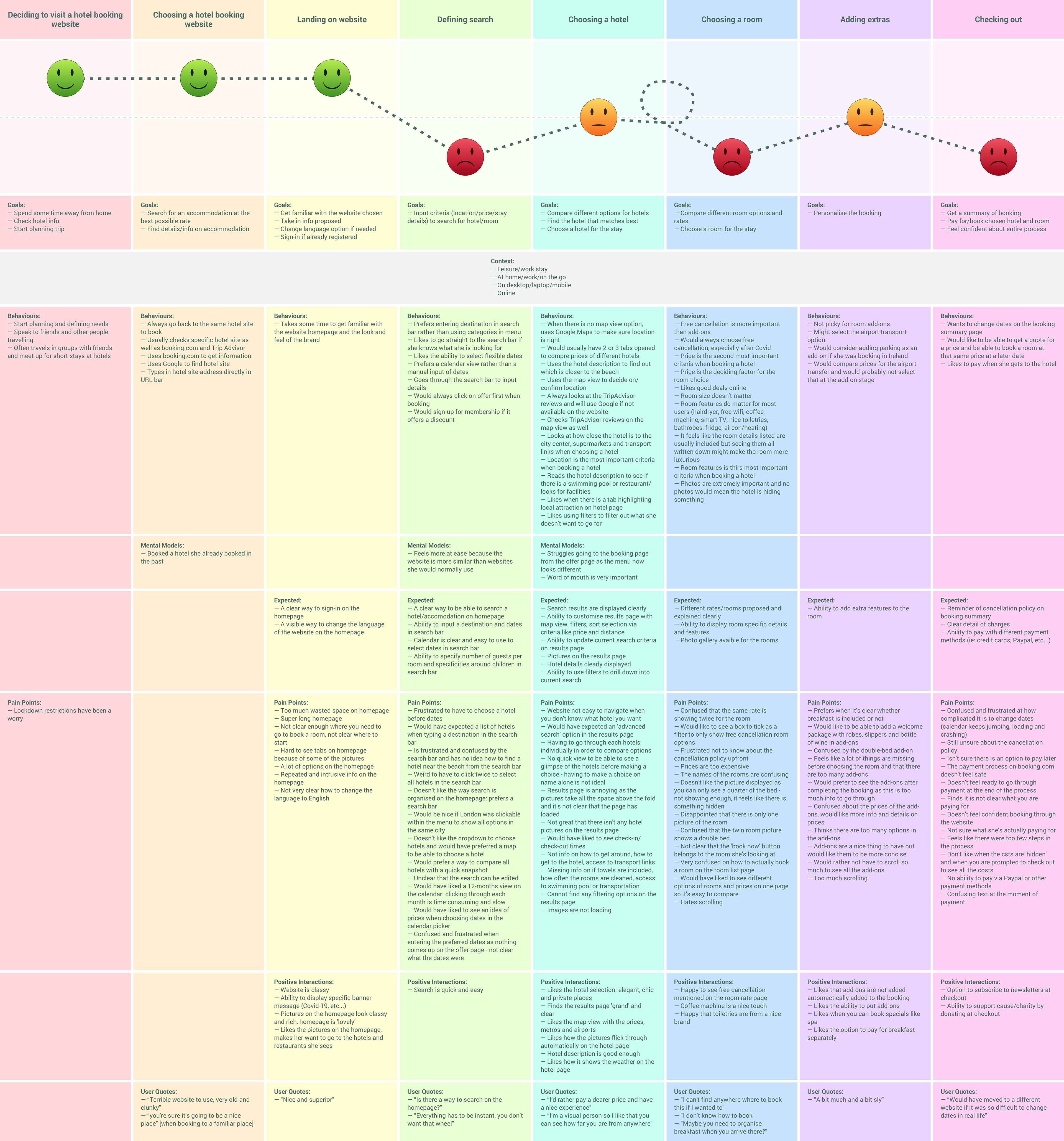
Full customer journey map created based on the affinity diagram. This depicts the happy path for a customer going through a hotel booking website and the experience they add based on the research I did

DESIGN
FLOW DIAGRAM FOR DESKTOP —
Following the analysis of the data I gathered since the beginning of the project, I started thinking about the design of the website. The first step was to put down on paper a high-level flow diagram for desktop. 

I've focused on one flow for the primary use case for the website. The main goal of this work was to understand how users would flow through my design. The flow diagram needed to address all the issues highlighted in the customer journey map.

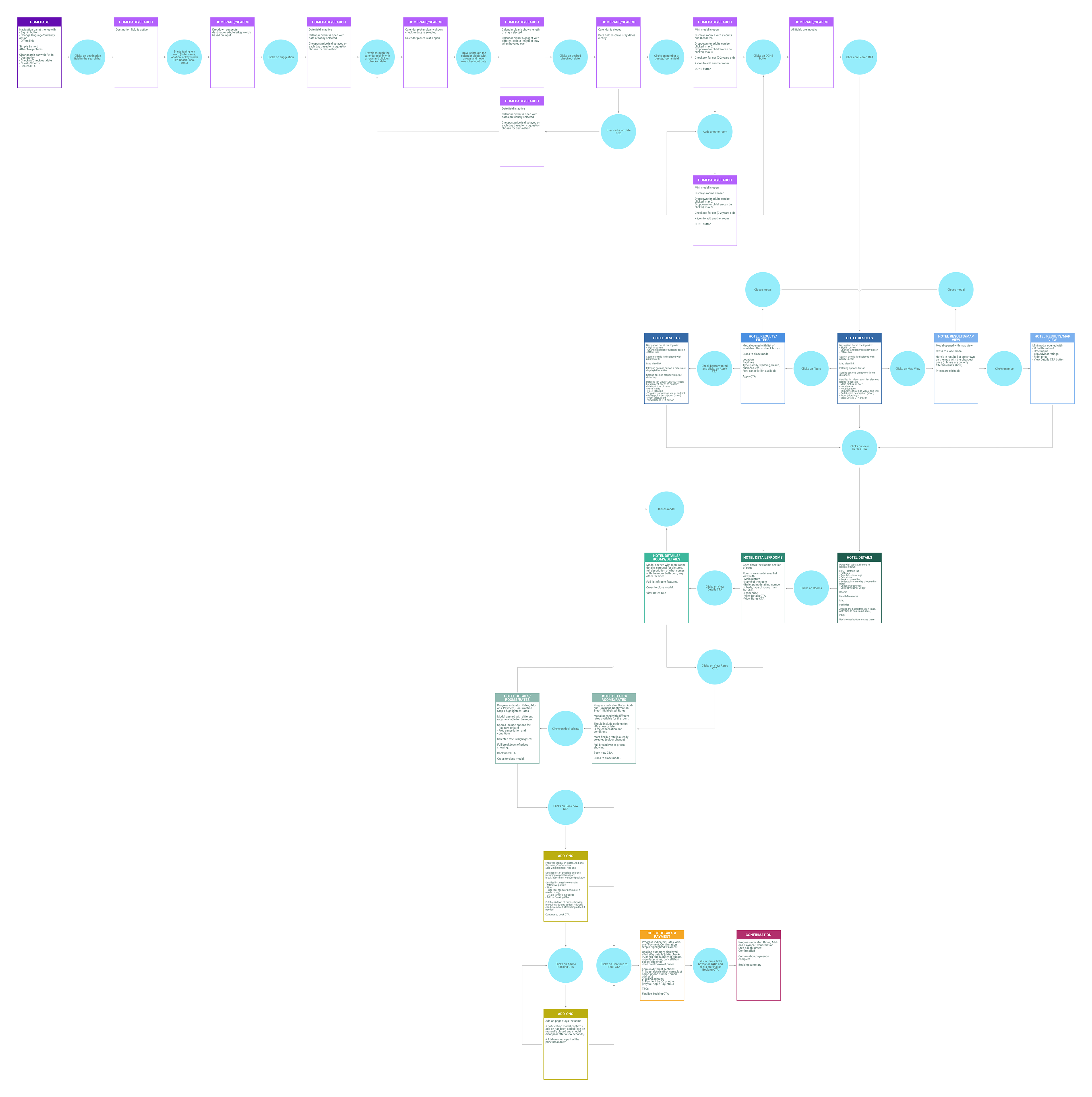
Full flow diagram created based on the data gathered so far. This depicts the primary use case for the website, showing screens and screen states

INTERACTION DESIGN FOR DESKTOP —
Building on the flow diagram created, the goal of this work was to sketch the screens and screen states for users flowing through the desktop app, while addressing all the issues and user goals identified in research and analysis. I created a list of screens and screen states based on my flow diagram, on paper. 

Here are a couple of screens I designed. 

Full interaction design document available upon request.
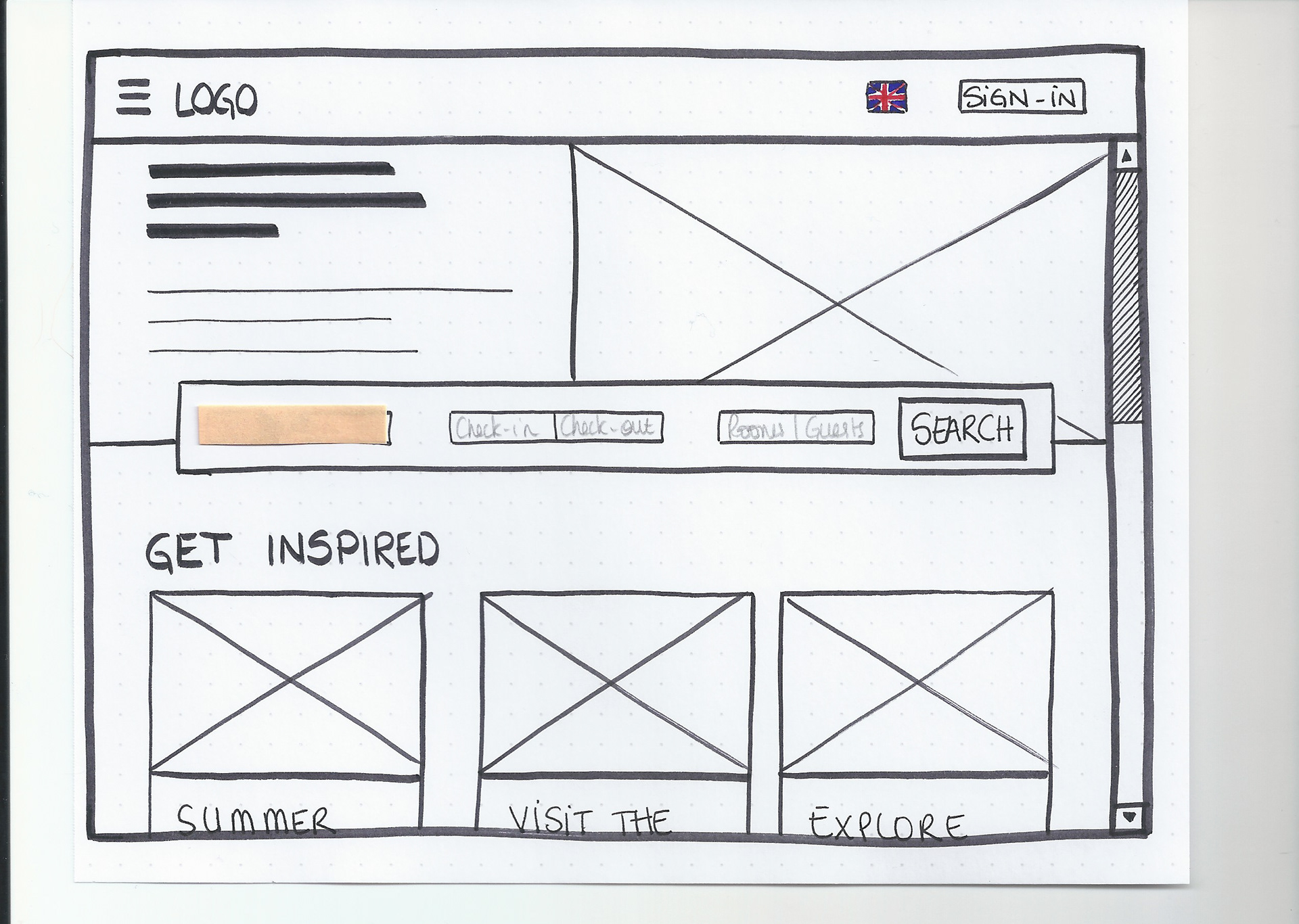
Sketch of the homepage of the hotel booking website
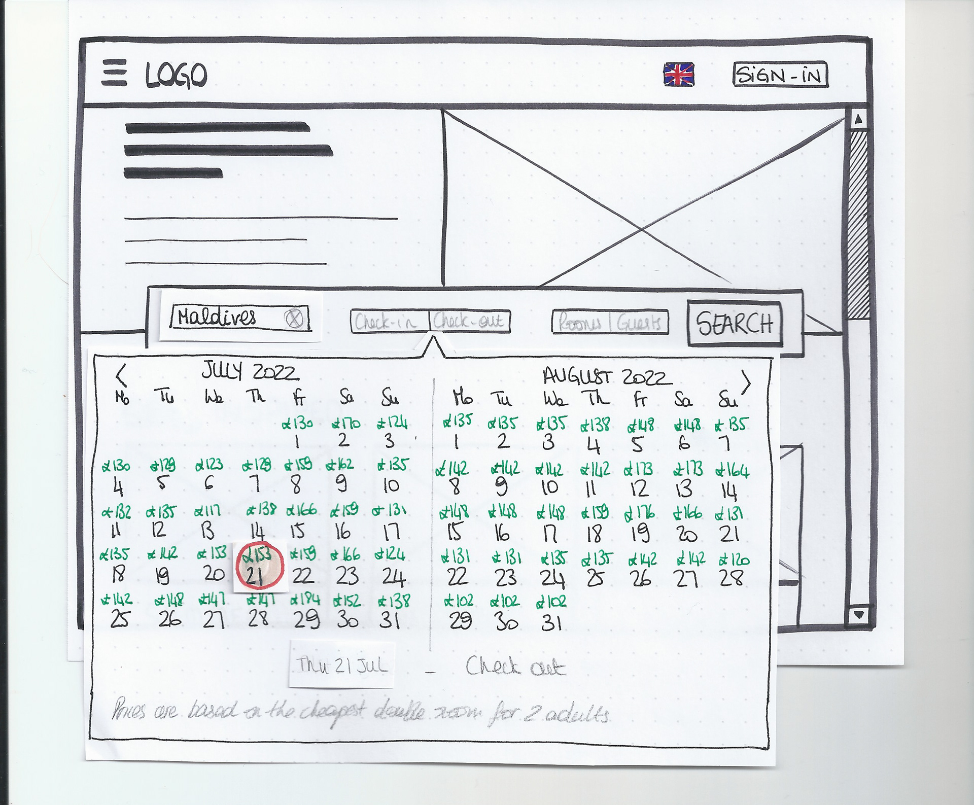
Sketch of the calendar option of the hotel booking website
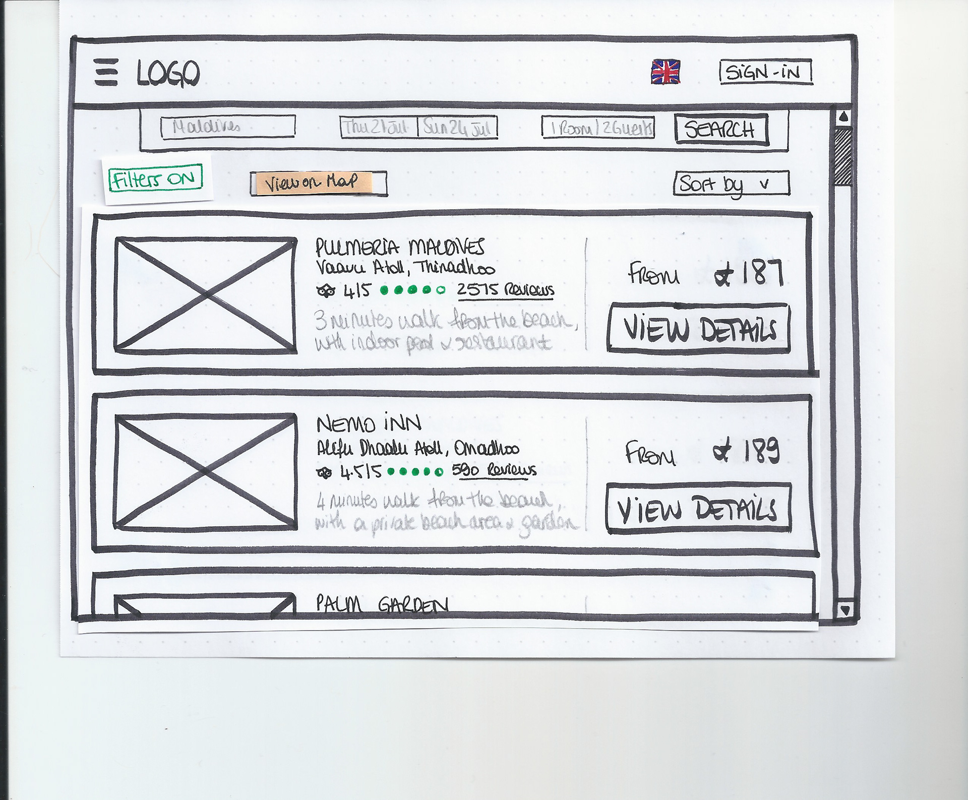
Sketch of the hotel results of the hotel booking website
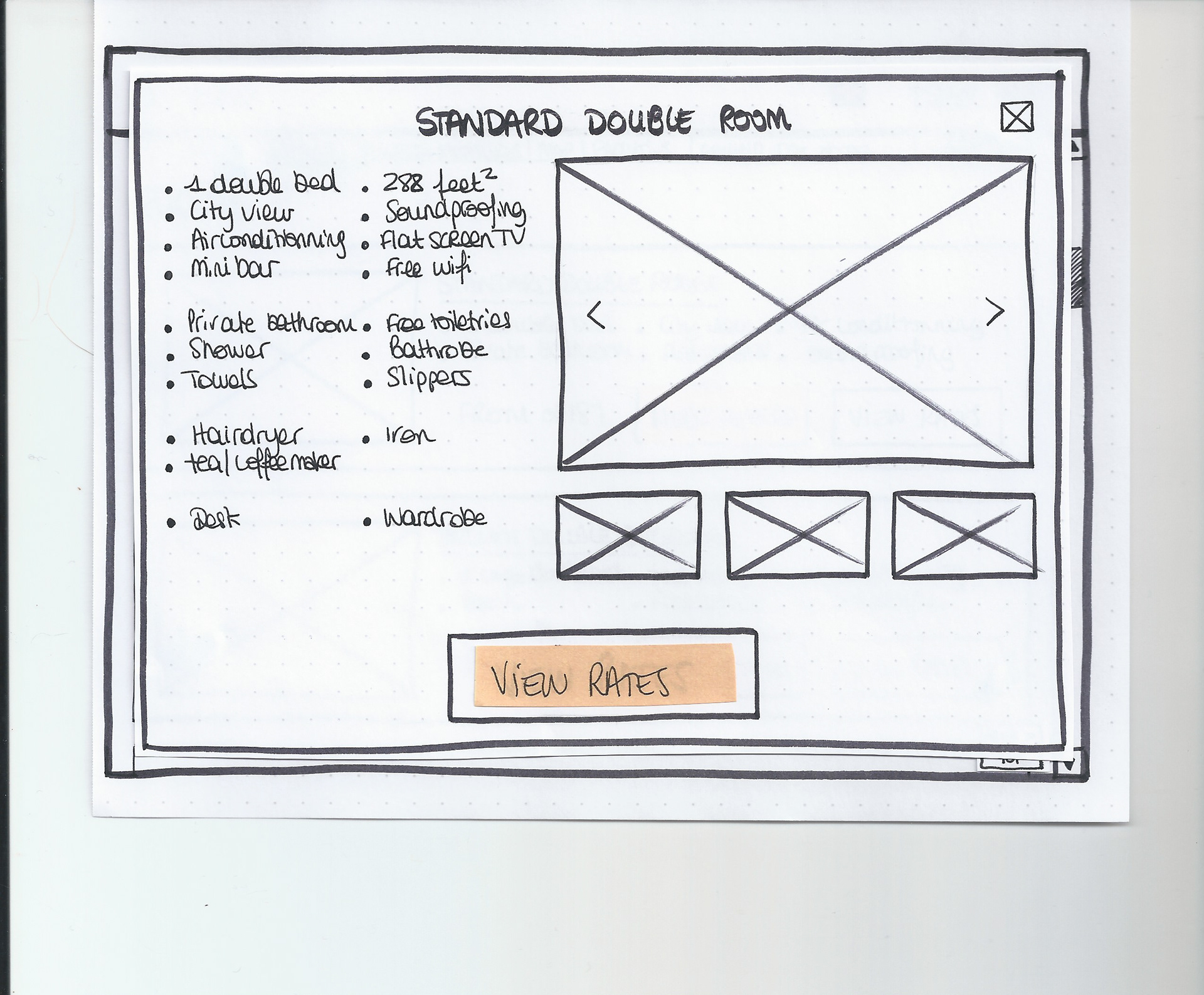
Sketch of the room details of the hotel booking website
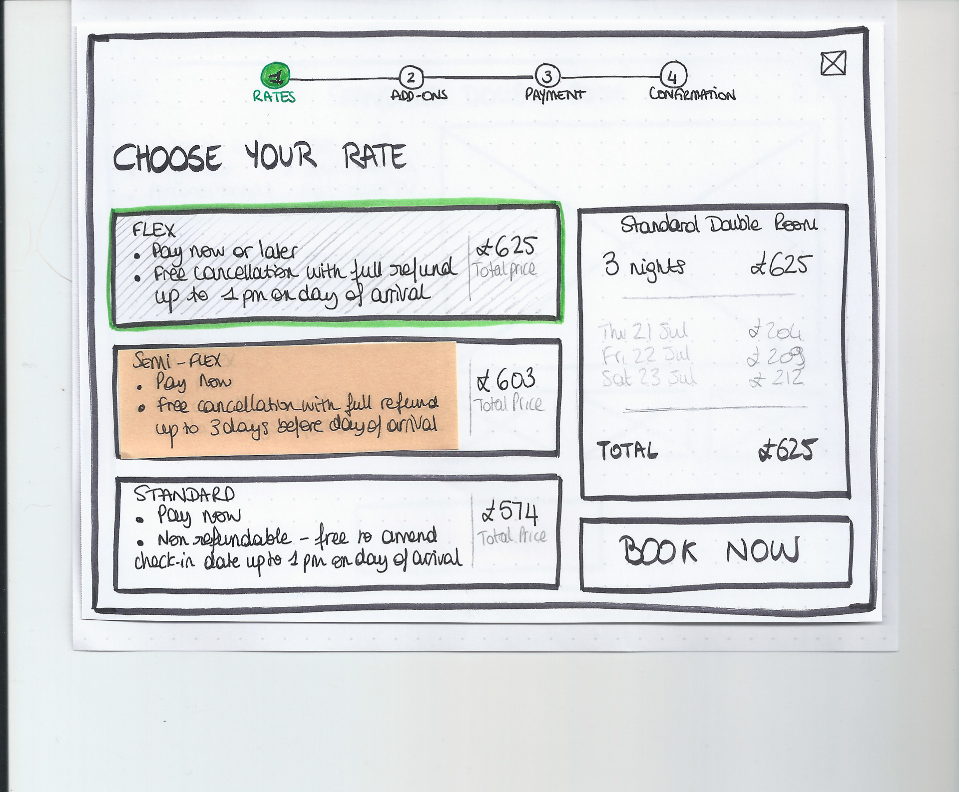
Sketch of the rates screen of the hotel booking website
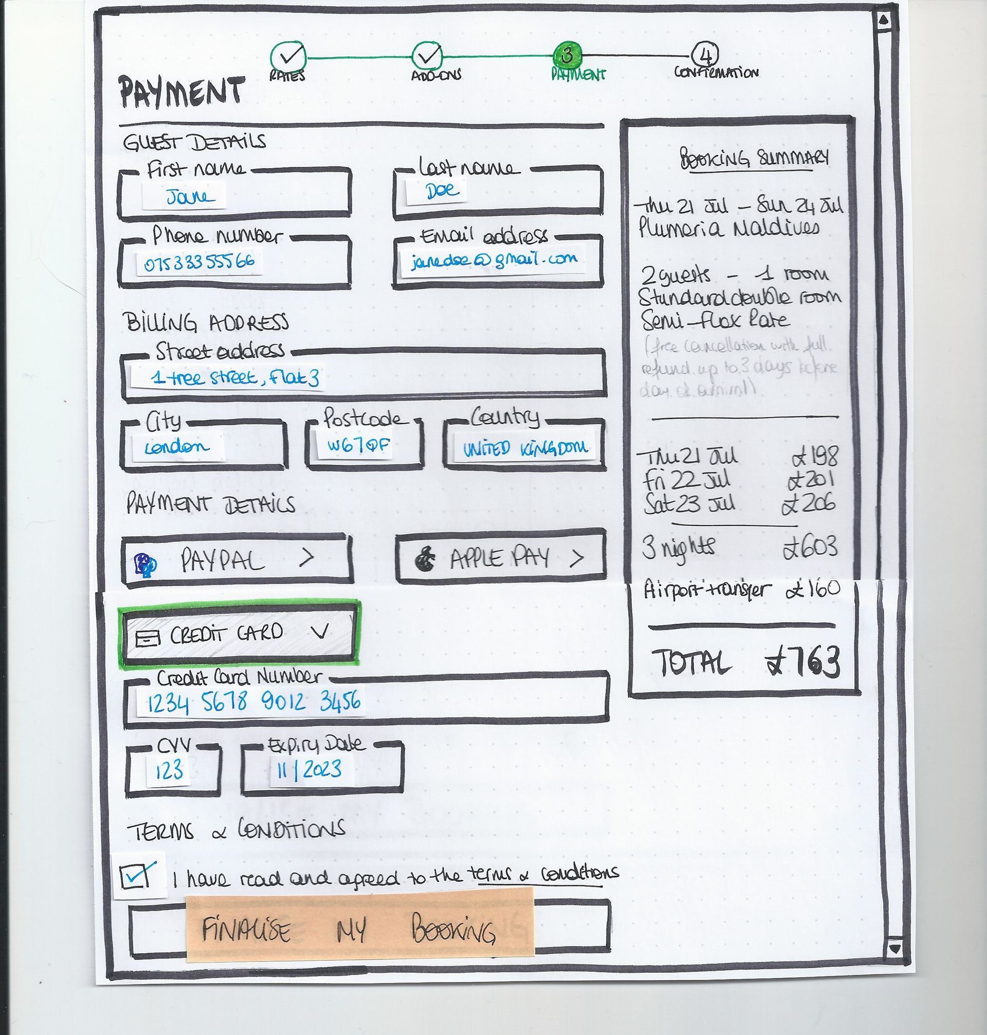
Sketch of the payment page of the hotel booking website
PROTOTYPE
PROTOTYPE FOR DESKTOP —
With everything I learned so far, I was able to work for a mid-fidelity prototype using Sketch. I used InVision to created the interactions in my prototype as I realised Sketch prototyping tools weren't as advanced as I needed. 

The prototype I created is only allowing for the happy path, some interactions have not been included on purpose, not to look track of the main objective. 

Here are a few screens from the prototype I created - the full video with interactions can be found at the top of this page.

Link to full prototype available upon request.
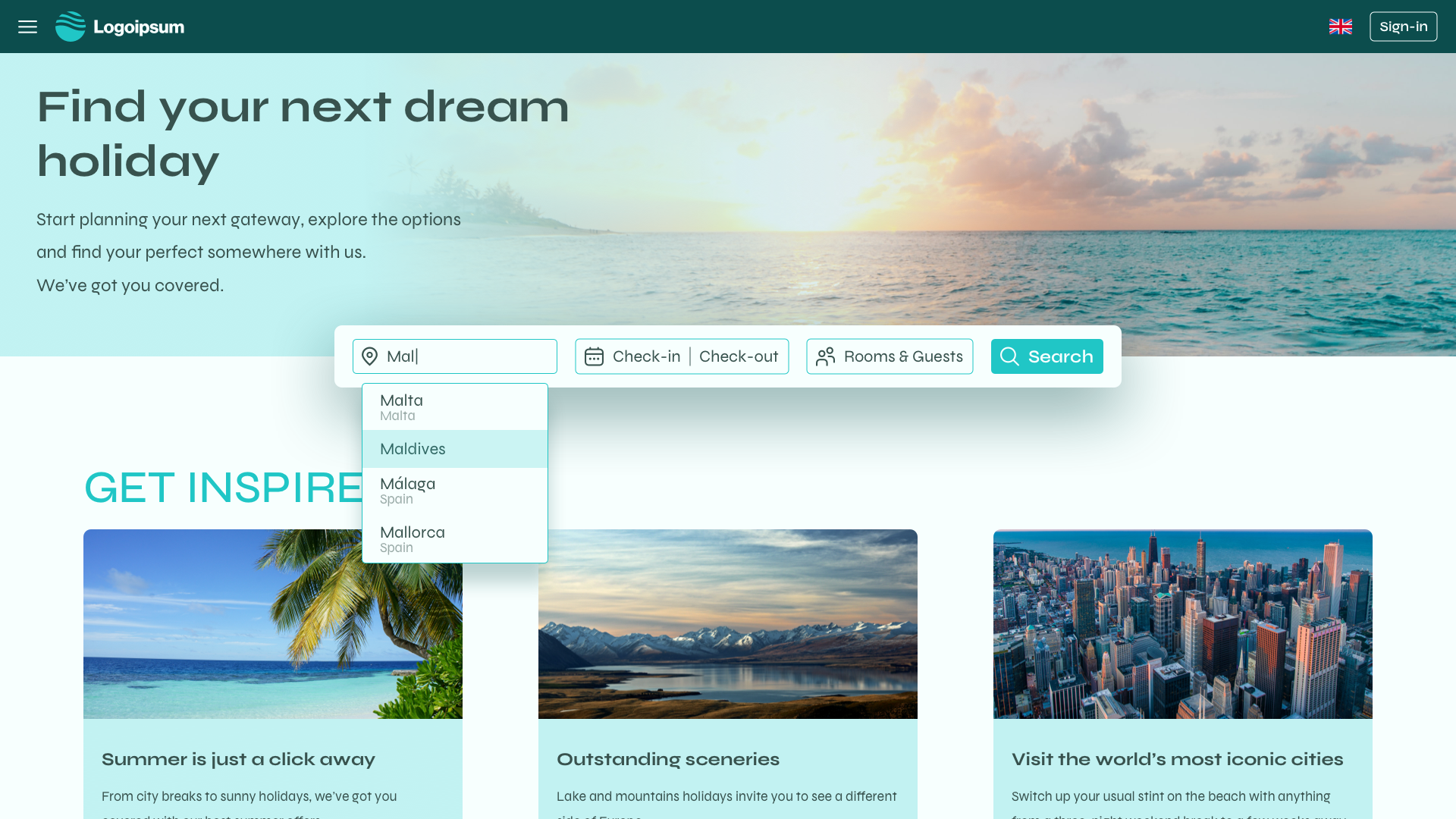
Prototype screen of the search page (homepage)
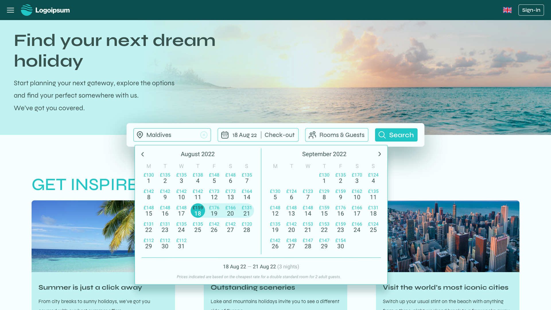
Prototype screen of the calendar module (homepage)
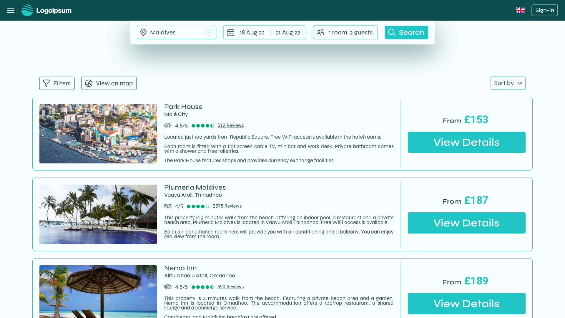
Prototype screen of the hotel results page
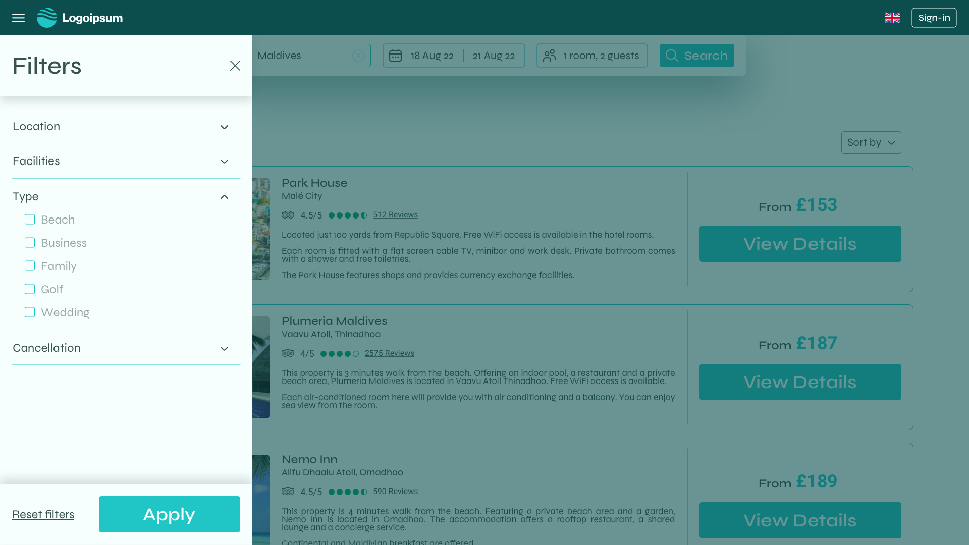
Prototype screen of the filters (hotel results page)
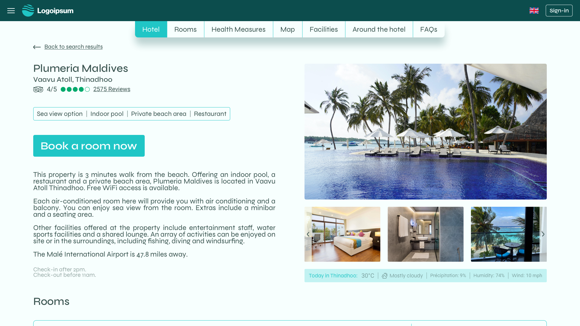
Prototype screen of the hotel details page
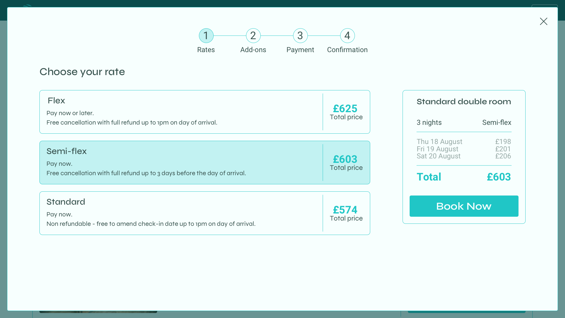
Prototype screen of the rates page
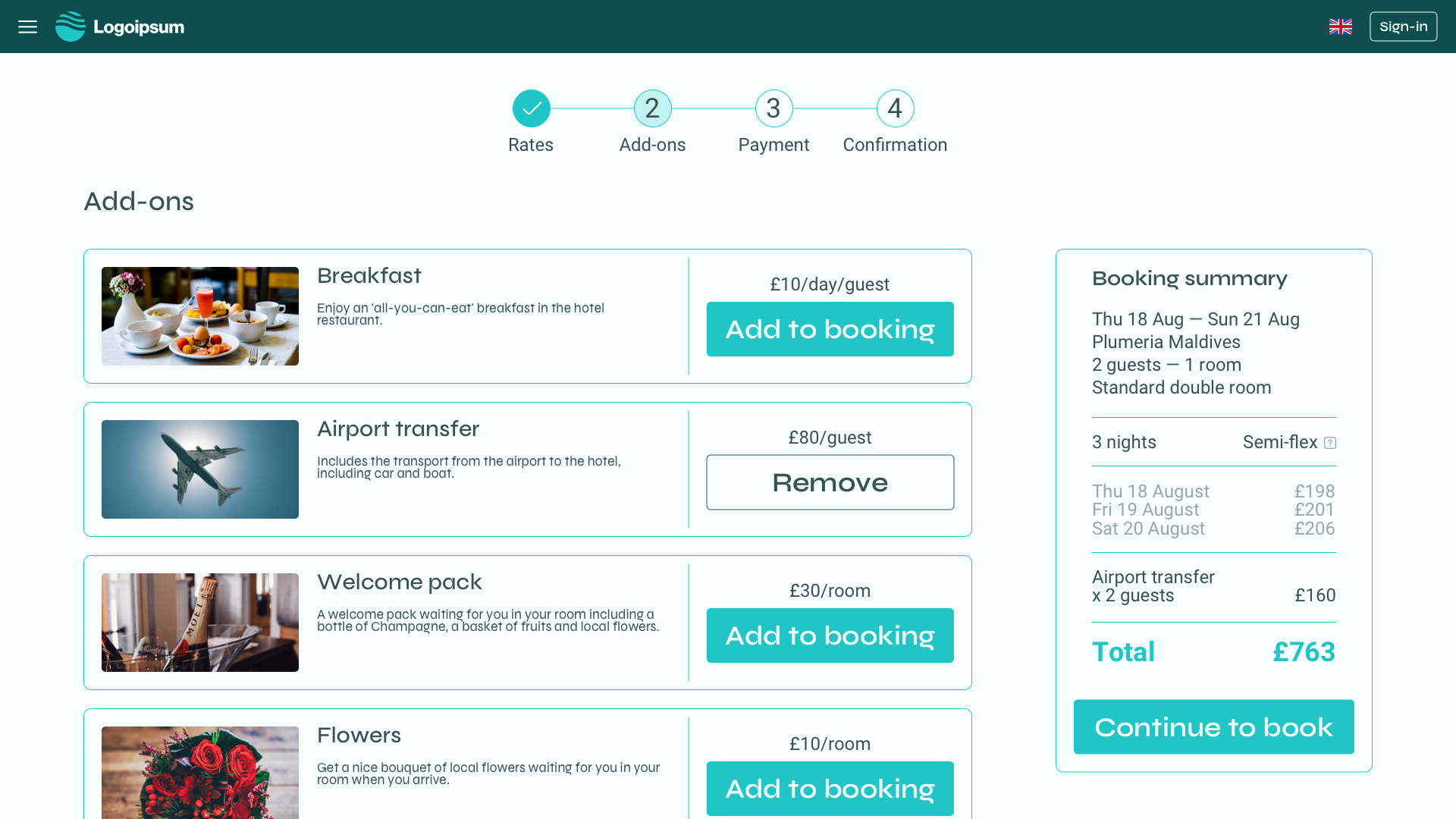
Prototype screen of the add-ons page
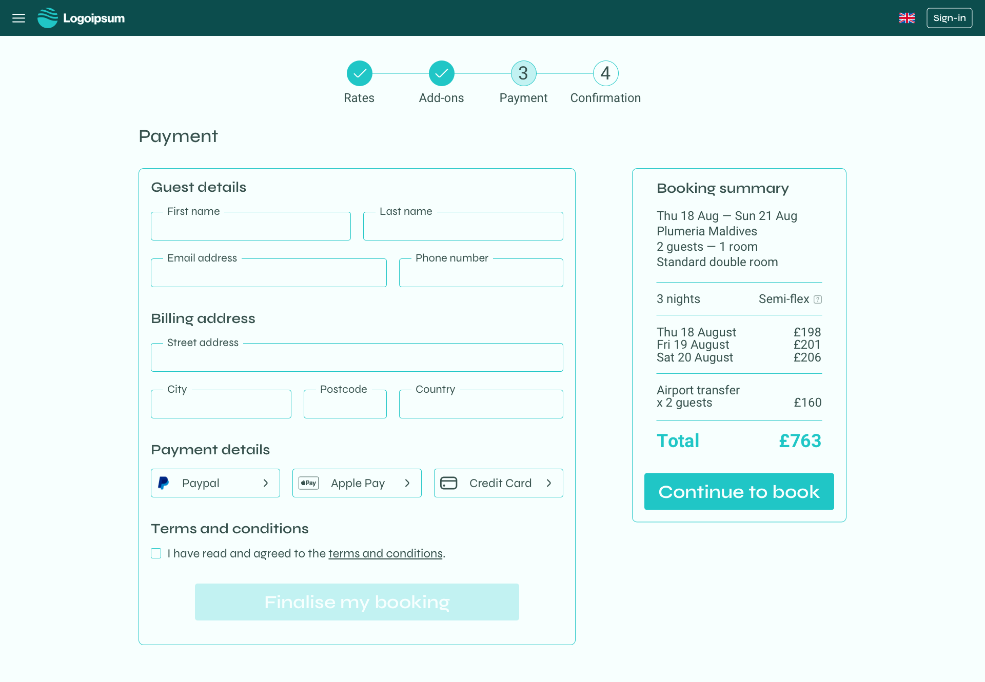
Prototype screen of the payments page
USABILITY TEST —
At this stage of the process, I decided to conduct another usability test to see if there were still issues that needed to be addressed with the design, and if the main issues highlighted during the research phase had been fixed. 

The feedback was very positive overall.
ANNOTATIONS FOR DESKTOP —
The last part of this project was to create annotations for my prototype, in order to facilitate the handover to a development team, should this project ever be coded. 

In order to do this, I recreated a version of my prototype (without the interactions) and added annotations next to each stream, following guidelines I've learned throughout the course.

Here are a few examples of the annotations I created.

Full annotations document available upon request.
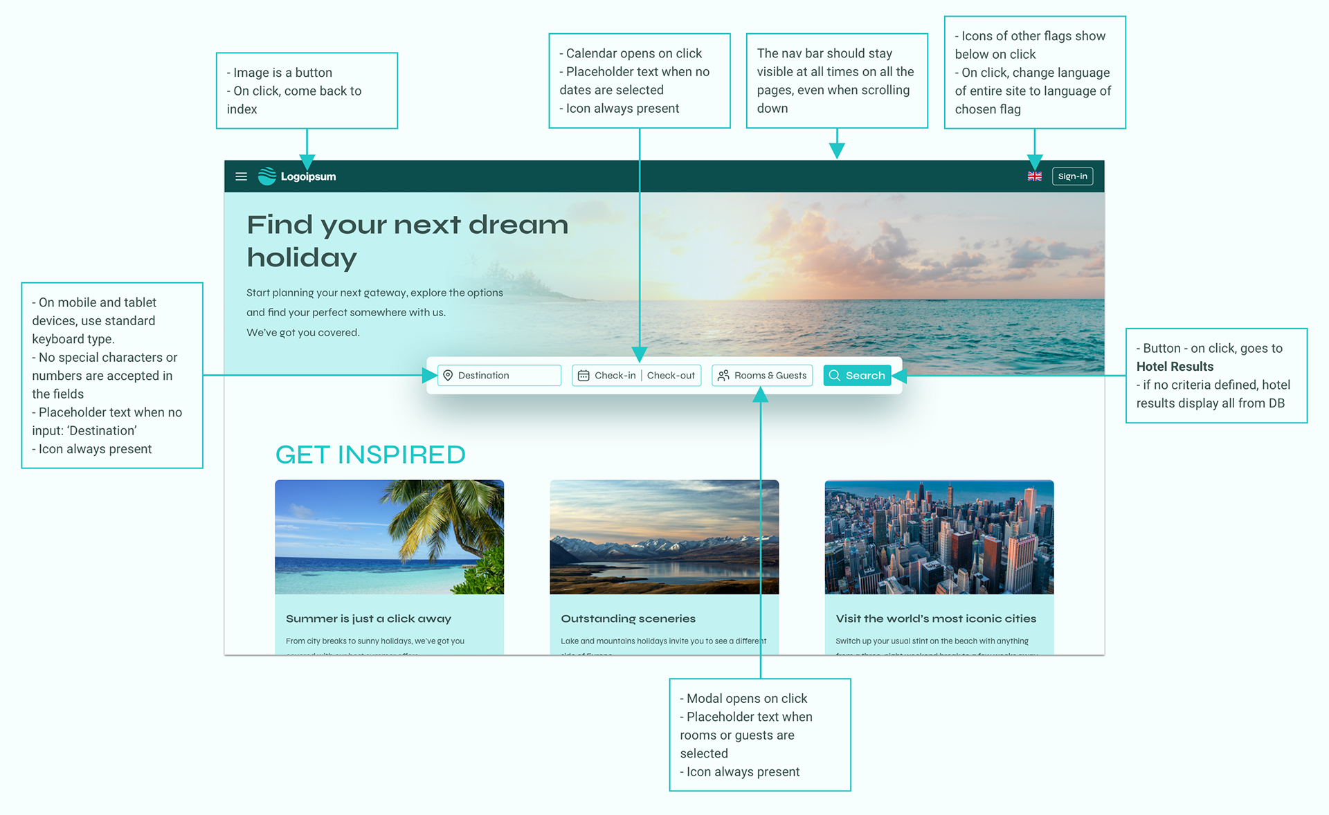
Annotations screen for the search (homepage)
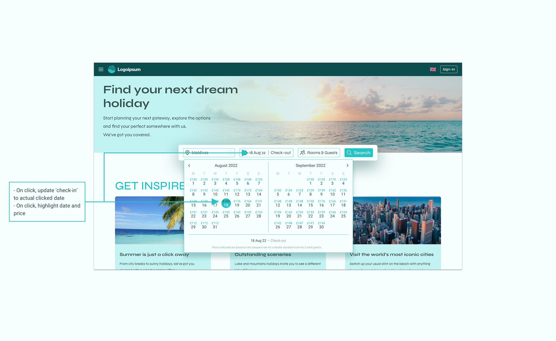
Annotations screen for the calendar module (homepage)
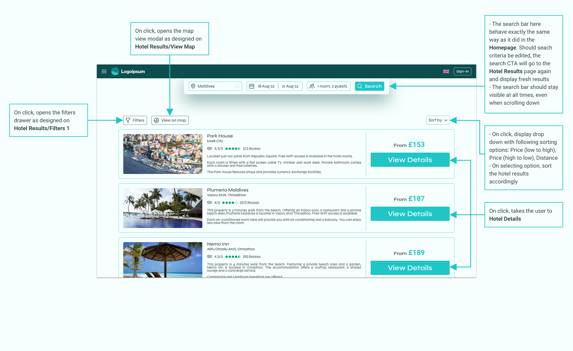
Annotations screen for the hotel results page
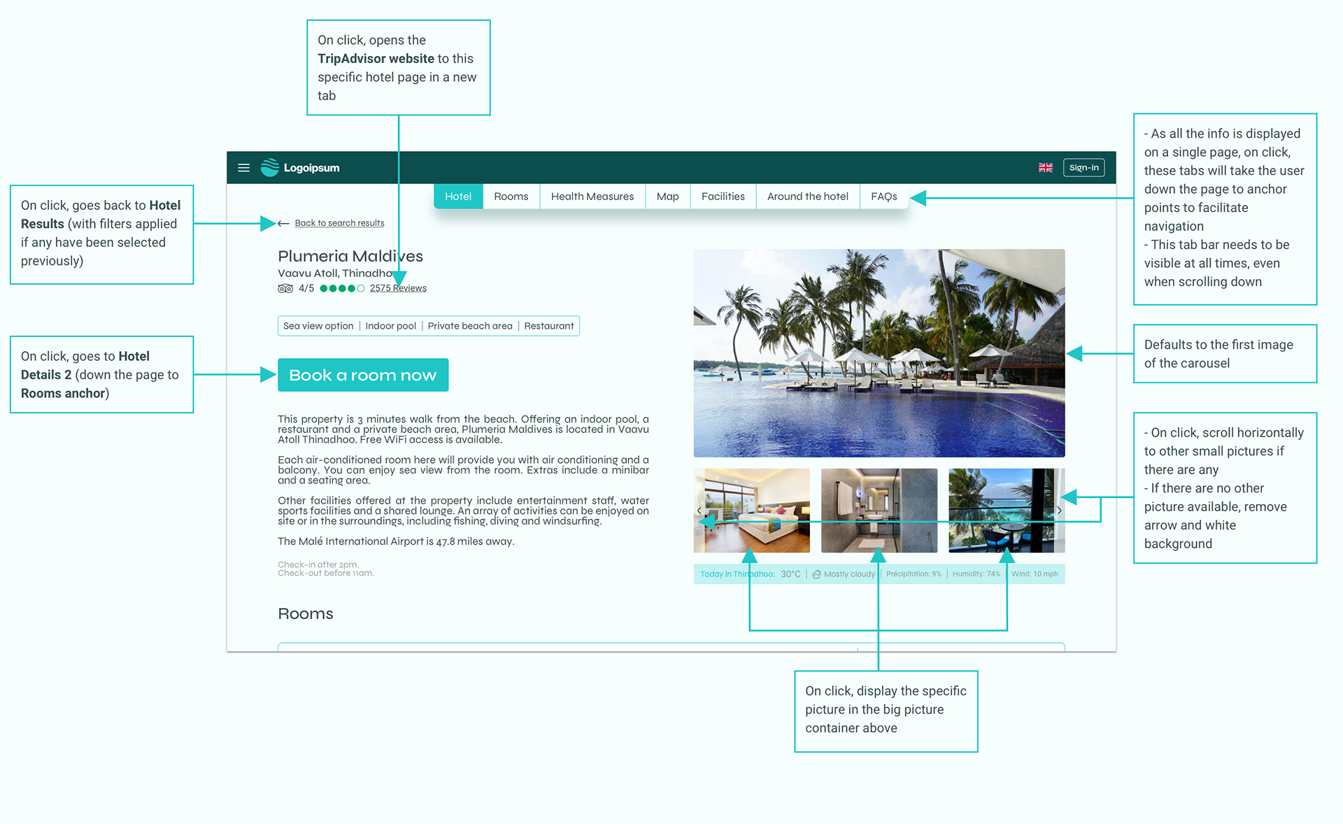
Annotations screen for the hotel details page
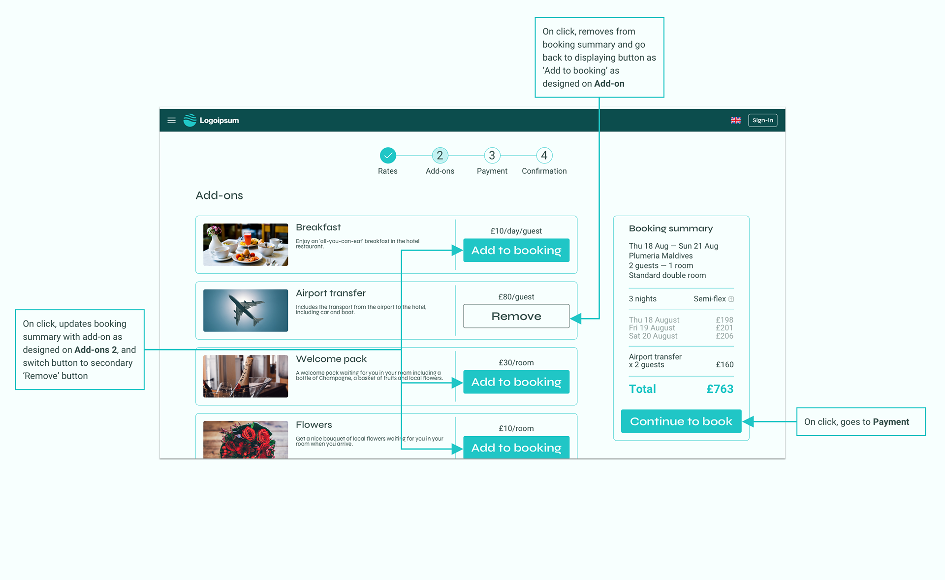
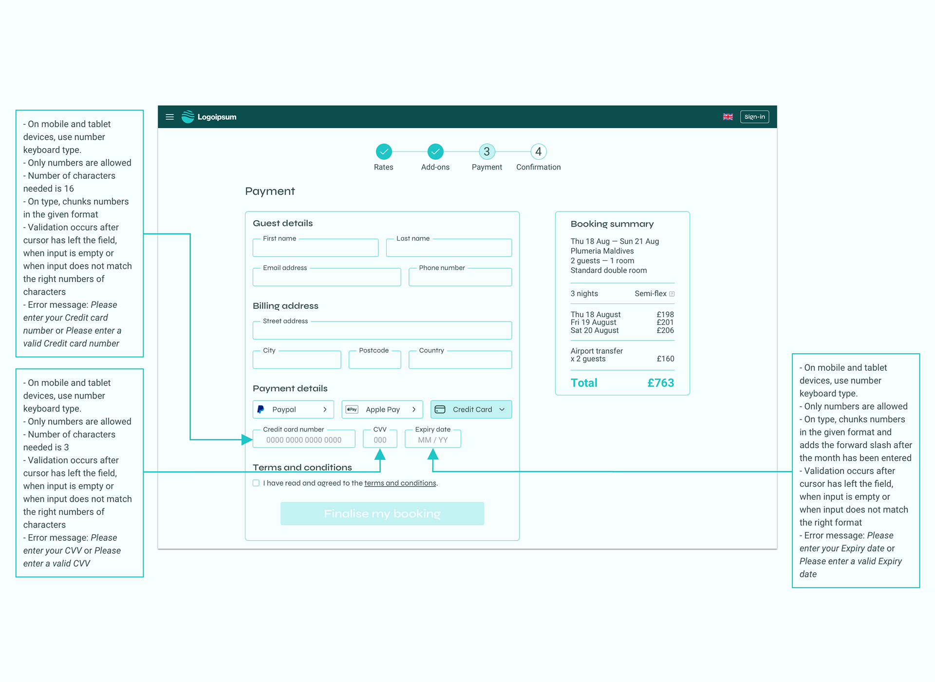
Annotations screen for the add-ons page
Annotations screen for the payments page

You may also like

Back to Top